Generate Excel from DataFrames
SQL2Excel supports exporting data and generating Excel visualization from Pandas DataFrames.
In fact, SQL2Excel works with DataFrame under the hood.
Writing Data
To export DataFrame to Excel without generating charts,
you need to create an instance of the Chart class and call its write_dataframe method.
You also need to create a Workbook using Openpyxl package and write the data into a sheet. See the example below.
# Use openpyxl to create Workbook (Excel file) and save it
import openpyxl as xl
from sql2excel.chart import Chart

df = ... # Create DataFrame

# Create a workbook
wb = xl.Workbook()

# Choose the active sheet
ws = wb.active

# Create a chart object
chart = Chart()

# Write dataframe
chart.write_dataframe(df, ws)

# Save the result
wb.save('path/to/file.xlsx')
Writing Data and Generating Charts
You can write data and generate a chart by creating an instance of the chart class of your choice and call its plot method. You can either place the chart to the right of the data or below the data by setting chart_position to 'right' or 'bottom' respectively. Default is 'right'.
import openpyxl as xl
from sql2excel.chart import LineChart

df = ... # Create DataFrame

# Create a workbook
wb = xl.Workbook()

# Choose the active sheet
ws = wb.active

# Create dummy data
desktop = ...
laptop = ...
tablet = ...
phone = ...

df = pd.DataFrame(
    {
        "Date": dates,
        "Desktop": desktop,
        "Laptop": laptop,
        "Baseline": [np.mean(laptop)] * len(laptop),
        "Tablet": tablet,
        "Phone": phone,
    }
)

chart = LineChart()
chart.plot(df, ws)

chart = LineChart()

# Let us have more customization here ...
chart.plot(
    df,
    ws,
    section_heading="Monthly sales (selecting specific columns - not consecutive)",
    title="Monthly sales",
    data_columns=[2, 4, 5], # which column to include in the chart
    line_width=3,
    line_style="sysDash",
    marker_symbol="circle",
    marker_size=8,
    # You can specify the starting row of your export
    # row_start=40,
    # starting column
    column_start=3,
    xlabel="Month",
    ylabel="Sales",
    width=25,
    height=10,
    # chart position relative to the data
    chart_position="bottom",
    rotation=30,
    # You can disable legend
    # show_legend=False,
    # legend position: 'r', 't', 'l', 'b'
    legend_position="t",
)
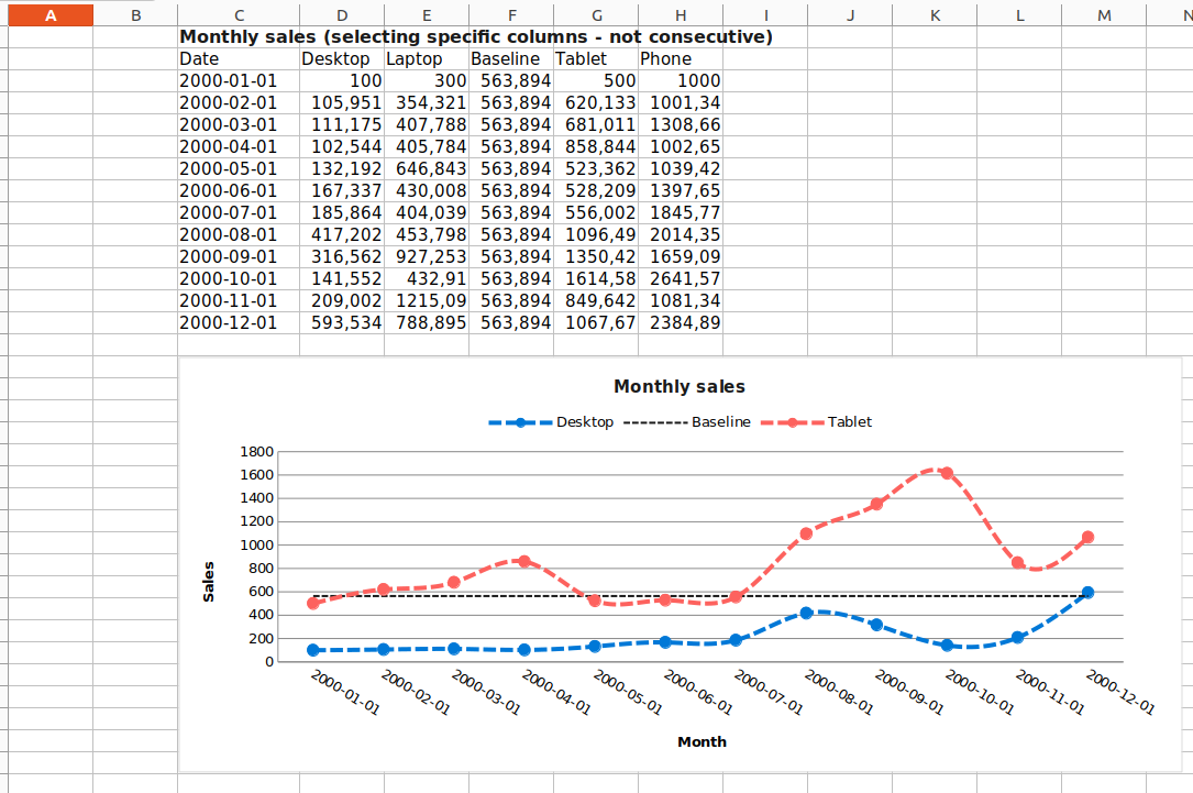
Notice that we start from Column C (because column_start=3). By default, the x-axis ticks are rotated by 45 degree. You can set rotation=0 if no rotation is needed.
LineChart detects a column that is constant (e.g. average) and plot it differently (e.g. in the above chart, you can see the column Baseline is plotted differently). You can customize this line from config.py. To disable this feature, you can either set use_ref_line to False when invoking plot or override the default configuration and set USE_REF_LINE to False. See Overriding Defaults for more information on overriding the default configurations. Refer to line_chart.py for examples of how to do this.
Note
Pivoting data is only supported if you use SQL scripts or QueryConfig as explained above. If you are working with DataFrames directly, pivot your data before calling write_dataframe or plot methods of Chart class.