Miscellaneous
Controlling Result Placement
In SQL2Excel, the starting row for writing results is dynamically determined based on the existing data and charts in the current sheet.
You can customize the spacing between two results set or between a result set and chart in the sql2excel.Config class:
SEPARATOR: Specifies the number of empty rows to insert between two result sets. It is applied after the row in which the new result will be written is calculated automatically depending on the existing data in the current sheet. For example, if the first result has 10 rows and you set theSEPARATOR=2, the second result will start at row 12.- The
CHART_HEIGHT_SCALE: defines the number of rows the chart occupies, calculated asrows = CHART_HEIGHT_SCALE * chart_height.
Note: By default, CHART_HEIGHT_SCALE is set to 1.9. However, the actual chart size will depend on operating system and device. If the default value does not meet your needs, adjust as required in your OS and device.
If required, the starting position of the result set can be determined manually with the arguments row_start and/or column_start of the plot or write_dataframe method of Chart class (and its subclasses).
Overriding Defaults
For consistency, some settings (e.g. font properties, color theme, etc) are set globally. There are two ways to override these defaults:
- Provide keyword arguments to
plotorwrite_dataframemethods of theChartclass (and its subclasses). - Create a
Configobject and override its attributes as needed.
The first method does not cover all attributes declared in Config class. The second approach is the preferred one. An example is shown below
from sql2excel.config import Config
from sql2excel.chart import BarChart

# Create a config object
config = Config()

# Change font size of the chart title to 14 pt (default is 11 pt)
config.CHART_TITLE_FONT_SIZE = 1400

# Use normal font weight
config.CHART_TITLE_FONT_BOLD = False

# Pass config to chart as a KEYWORD argument
chart = BarChart(config=config)

# You can reuse `config` with other charts to apply the same settings across the report
Database Connection Options
Report accepts several connection types. You must provide exactly one of:
db_url: A SQLAlchemy connection URL string.engine: An existingsqlalchemy.engine.Engine.conn: An existingsqlalchemy.engine.Connection.session: An existingsqlalchemy.orm.Session.
from sqlalchemy import create_engine
from sql2excel.report import Report

engine = create_engine("postgresql://user:pass@localhost/mydb")
report = Report(engine=engine)
report.generate(query_configs, file_name="output.xlsx")
Silent Mode
When silent=True, query execution errors produce warnings instead of raising exceptions. This is useful when running multiple queries and you want the report to continue even if one query fails.
report = Report(db_url=db_url, silent=True)
DataFrame Pivoting
Query results can be pivoted before writing to Excel by passing index, columns, and values to QueryConfig. This uses pd.pivot internally.
from sql2excel.sqlexec import QueryConfig

qc = QueryConfig(
    sql="SELECT country, year, revenue FROM sales;",
    index="country",
    columns="year",
    values="revenue",
)
In a SQL script, this is expressed via directives:
-- index=country, columns=year, values=revenue
SELECT country, year, revenue FROM sales;
Exec Directive
Use -- exec to execute a query (e.g., for DDL or DML) without writing results to Excel. Queries without chart or exec are skipped when parsing a SQL script.
-- exec
CREATE TABLE IF NOT EXISTS tmp AS SELECT * FROM source;

-- chart=bar
-- title=Revenue by Region
SELECT region, SUM(revenue) FROM tmp GROUP BY region;

-- The query below will be SKIPPED
SELECT * FROM foo.bar;
Multi-Sheet Output
Results can be placed on named worksheets using the sheetname directive. All queries sharing the same sheetname are written to the same sheet.
-- sheetname=Revenue
-- chart=bar
-- title=Revenue by Region
SELECT region, revenue FROM sales;

-- sheetname=Costs
-- chart=bar
-- title=Cost by Region
SELECT region, cost FROM costs;
SQL Parameterization
query_param
Use query_param to define named parameters with pipe-separated values. The parser generates the Cartesian product of all query_param directives, creating one QueryConfig per combination.
-- query_param: year = 2023 | 2024
-- chart=bar
SELECT region, revenue FROM sales WHERE year = :year;
This produces two queries: one for year=2023 and one for year=2024. The parameter name in section_heading is replaced with the actual value.
sheet_param
Use sheet_param to repeat the same analysis for different entities, each on a separate worksheet. Only one sheet_param name is allowed.
-- sheet_param: country = USA | UK | Germany
-- chart=bar
-- title=Revenue in :country
SELECT region, revenue FROM sales WHERE country = :country;
This creates three sheets (USA, UK, Germany), each containing the same query filtered by the respective country.
CLI Environment Variables
The CLI reads database parameters from environment variables when flags are not provided:
| Variable | Maps to |
|---|---|
DB_DIALECT |
--dialect |
DB_HOST |
--host |
DB_PORT |
--port |
DB_USER |
--user |
DB_PASSWORD |
--password |
DB_NAME |
--dbname |
export DB_DIALECT=postgresql
export DB_HOST=localhost
export DB_PORT=5432
export DB_USER=username
export DB_PASSWORD=secret
export DB_NAME=mydb

sql2excel query.sql --output report.xlsx
.dbpass File
The CLI can read passwords from ~/.dbpass instead of passing them on the command line. Each line follows the format:
dialect:host:port:user:password:dbname
Use * as a wildcard in any field. If multiple entries match, the most specific one (fewest wildcards) wins. Lines starting with # are ignored. The file must have 0600 permissions and be owned by the current user.
# ~/.dbpass example
postgresql:localhost:5432:username:secret:mydb
postgresql:*:5432:username:secret:*
The difference between these two entries lies in their scope:
-
Line 1 (Specific): Applies credentials only when connecting to the
mydbdatabase onlocalhost. -
Line 2 (Wildcard): Applies credentials to any database on any host (using * wildcards).
Use Line 1 to restrict credentials to a specific local database, and Line 2 as a catch-all fallback for any Postgres connection.
Matching Priority
If multiple lines match your connection details, SQL2Excel automatically uses the most specific match available.
Custom Column Headings
Override DataFrame column names with the headings directive. Provide a list of strings in the annotation.
-- chart=bar
-- headings=["Region", "Total Revenue ($M)"]
SELECT region, revenue FROM sales;
Tip
Custom headings are most useful when using dataframes. Use headings to quickly rename export columns. No need to modify column names in Pandas first.
Available Chart Types
| Directive | Class | Description |
|---|---|---|
chart |
Chart |
Data-only (no chart, just writes the DataFrame). |
bar |
BarChart |
Column or bar chart. |
stackedbar |
StackedBarChart |
Stacked or percent-stacked bar chart. |
line |
LineChart |
Line chart. |
pie |
PieChart |
Pie chart with data labels. |
area |
AreaChart |
Area chart. |
radar |
RadarChart |
Radar (spider) chart. |
scatter |
ScatterChart |
Scatter plot. |
bubble |
BubbleChart |
Bubble chart (x, y, size from first 3 columns). |
barline |
BarLineChart |
Combined bar and line with dual y-axes. |
singleaxisbarline |
SingleAxisBarLineChart |
Combined bar and line on a single y-axis. |
-- chart=scatter
-- title=Revenue vs. Cost
SELECT revenue, cost, region FROM sales;
Chart-Specific Options
Bar / Stacked Bar
| Option | Description |
|---|---|
chart_type |
Bar orientation: "col" (vertical, default) or "bar" (horizontal). |
chart_grouping |
Stacked bar grouping: "percentStacked" (default) or "stacked". |
chart_overlap |
Overlap percentage for stacked bar (default: 100). |
vary_color |
Assign a different color to each bar in a single-series chart. |
Line / Radar
| Option | Description |
|---|---|
smooth |
Smooth the lines (default: True). |
line_width |
Line width in points (default: 1.5). |
line_style |
Dash style: "solid", "sysDash", "dot", "dashDot", etc. |
line_color |
Override line color for all series. |
marker_symbol |
Marker shape: "circle", "triangle", "diamond", etc. |
marker_size |
Marker size (default: 6). |
chart_type |
Radar style: "standard", "marker", or "filled". |
radar_unit |
Custom unit step for the radar y-axis. |
radar_unit_steps |
Number of divisions for the radar y-axis. |
Pie
| Option | Description |
|---|---|
show_percentage |
Show percentage labels (default: True). |
show_category |
Show category names (default: True). |
show_legend_key |
Show legend key in labels (default: False). |
show_values |
Show values in labels (default: False). |
show_series_name |
Show series name in labels (default: False). |
Scatter
| Option | Description |
|---|---|
marker_symbols |
List of marker symbols to cycle through per series. |
BarLineChart (Dual Axes)
The first data column is plotted on the primary axis; remaining columns on the secondary axis. Secondary-axis settings use a 2 suffix.
| Option | Description |
|---|---|
ylabel2 |
Label for the secondary y-axis. |
ylim2 |
Limits (min, max) for the secondary y-axis. |
y_orientation2 |
Orientation of the secondary y-axis. |
yaxis_major_unit2 |
Major unit for the secondary y-axis. |
y_log_base2 |
Logarithmic base for the secondary y-axis. |
SingleAxisBarLineChart
| Option | Description |
|---|---|
bar_columns |
List of column indices to plot as bars. |
line_columns |
List of column indices to plot as lines. |
By default, the first data column is the bar and the rest are lines.
ImageChart
| Option | Description |
|---|---|
add_image |
Accepts a file path (str) or a matplotlib.figure.Figure. |
image_width |
Image width in pixels. |
image_height |
Image height in pixels. |
Featured Options
| Option | Description |
|---|---|
| Data Writing | |
write_dataframe |
A method of Chart (and its subclasses) to write a result set (SQL/DataFrame) into an Excel sheet. |
write_dataframes_side_by_side |
A method of Chart (and its subclasses) to write multiple DataFrames side by side in an Excel sheet. |
| Chart Generation | |
plot |
A method of Chart (and its subclasses) to plot charts |
| Manual Placement of Resultset | |
column_start |
Sets the starting column for writing data. Defaults to 1. |
row_start |
Sets the starting row for writing data. The default is determined dynamically depending on the existing data in the sheet. |
chart_position |
Specifies the position of the chart relative to data. Defaults to 'right' (the chart is written next to the data). Possible values: 'right' and 'bottom'. |
| Data for Charts | |
data_columns |
Specifies the columns to be used for chart data. Default all columns will be used and the first column is assumed the category (the x-axis). Useful when the specified columns are not consecutive. |
data_column_start |
Specifies the starting column for data in the chart. Useful when the specified columns are consecutive. |
data_column_end |
Specifies the end column for data in the chart. Useful when the specified columns are consecutive. |
| Chart Formatting | |
chart_shape |
Sets the shape of the chart (same as in Openpyxl). |
chart_style |
Sets the style of the chart (same as in Openpyxl). |
legend_position |
Sets the position of the chart legend. |
show_legend |
Determines whether to show the chart legend. |
smooth |
Sets whether the lines are smoothed or not (relevant for LineChart only). |
height |
Sets the height of the chart. |
width |
Sets the width of the chart. |
border_line_color |
Sets the border line color for the chart series. |
line_color |
Sets the line color for the chart series. |
line_style |
Sets the line style for the chart series. |
line_width |
Sets the line width for the chart series. |
nofill |
Prevents filling the chart series with colors. |
marker_size |
Sets the size of the markers on the chart series. |
marker_symbol |
Sets the symbol of the markers on the chart series. |
| Chart Title | |
title |
Sets the title of the chart. |
title_font_name |
Sets the font name of chart title.. |
title_font_size |
Sets the font size of chart title.. |
title_font_color |
Sets the color of the font of chart title. |
title_font_bold |
Whether to set the chart title's font to bold. |
| Axis Settings | |
x_log_base |
Sets the logarithmic base for the x-axis. |
y_log_base |
Sets the logarithmic base for the y-axis. |
xlim |
Sets the limits for the x-axis. |
ylim |
Sets the limits for the y-axis. |
xlabel |
Sets the label for the x-axis. |
ylabel |
Sets the label for the y-axis. |
rotation |
Sets the rotation of the x-axis tick labels. |
y_orientation |
Sets the orientation of the y-axis. |
yaxis_major_unit |
Sets the major unit for the y-axis. |
axis_font_name |
Sets the the font name of the xlabel and ylabel. |
axis_font_size |
Sets the the font size of the xlabel and ylabel. |
axis_font_color |
Sets the the font color of the xlabel and ylabel. |
axis_font_bold |
Whether to set the the font of the xlabel and ylabel to bold. |
xtick_label_position |
Placement of xticks. |
| Miscellaneous | |
add_image (ImageChart) |
Adds an image to the sheet. Useful for including Matplotlib figures and/or externally generated figures. |
section_heading |
A title to add in the cell above the DataFrame. |
headings |
Custom column headings to use instead of the DataFrame's column names. |
| DataFrame Pivoting | |
index |
Column to use to make new frame’s columns. |
columns |
Column to pivot into new column headings. |
values |
Column to to use for populating new frame’s values. |
Colors
Color Scheme
SQL2Excel overrides the default color scheme of Openpyxl. The color scheme of SQL2Excel is shown below.

The default Openpyxl color theme is shown below.
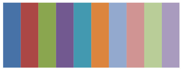
You can provide your own colors by overriding PRIMARY_COLORS of Config class.
You can do that by creating an instance of Config class and overriding its PRIMARY_COLORS attribute and set its CUSTOM_COLORS to True. Alternatively, you can pass custom_colors=True to the plot method of the Chart class.
You can also revert back to Openpyxl default color by setting CUSTOM_COLORS to False or passing custom_colors=False to the plot method of the Chart class. An example:
chart = BarChart()
chart.plot(df, ws,  custom_colors=True)
If you are reusing the custom colors a better way is shown below:
config = Config()
config.CUSTOM_COLORS = True
# Optional, you can provide you own colors
# config.PRIMARY_COLORS = ["#FF0000", "#00FF00", "#0000FF"]


# Create a chart object with the new config
chart = BarChart(config=config)
chart.plot(df, ws)

# Reuse the new config object with another chart
chart = LineChart(config=config)
chart.plot(df, ws)
Font and Shape Colors
You can provide the colors for chart title and the labels for the x-axis and y-axis by specifying the color name or the color code in hex format. If a color name is provided, it must be chosen as a prstClr color as in the openpyxl guide (here) where all available prstClr colors are listed.
The color of the section heading (the cell above the data and chart) can only provided as a color code. You can use online color pickers to find the color code of your choice such as this color picker.
Shape colors (line colors and fill colors) should be provided as color code in the hex format